Russell Davies has covered the basics of presentations over on his blog, I’m not going to rehash what he’s said there. He’s covered making slides readable, making ideas clear, managing audience attention and finally not putting pictures of money on slides about budgets. You should probably read those before you read this.
These posts are terrific, so I thought I’d wrap all of his advice (and some of my own) up into a white-label keynote theme that people can then build on top of.
Sometimes presentations are for big auditoriums, where people are barely paying attention and it’s warm and dark, and sometimes presentations are for rooms of 10 people. The slide deck you create for the highly engaged 10 person audience is not the same as the one you write for the 500 person audience.
This blog post is about presentations for a big audience.
Here’s the theme: Keynote, Powerpoint (thanks, Dan!), Google slides (thanks, Kim!). Now I’m going to talk about each slide in it.
Your basic slide
First things first, you need a basic slide. The design of these slides is about lessening the impact of things that go wrong with technology.
I’ve used a system font so that if I have to present off someone else’s computer, they’ll definitely have the font installed and my formatting won’t unexpectedly break.
Most of these slides use a dark on light design so that if the projector is terrible and the room is really bright, you’ll still be able to read them. Rebecca Murphey has a good post on this.
I’ve used big margins at the left, right and top so if the projector isn’t lined up properly with the screen none of my important words will go missing.
In case someone comes in half way through, put some way of finding out who you are (your name or Twitter handle) on the slide.

A basic slide with a picture
Keeping in mind Russell’s advice: “Illustrate, don’t decorate”, sometimes I need pictures with some text.


A blank slide
My keynote theme has a completely blank slide for charts and diagrams. Charts and diagrams are where even good presenters can get into trouble. My only advice is make your labels as big as possible, and think carefully about what you’re trying to show. People looking at a chart or diagram in a report have more time to pore over it than they do when looking at your slide in a presentation. Manage your audience’s focus by highlighting the important bits of a chart, and obscuring the other bits.

Your title slide
It’s a really really good idea to have a title slide. It means that while you’re futzing around with the presenter display in the pre-talk bit the audience isn’t reading your slides, they’re just looking at your name and the title of your talk. Again, give people a way to find out more about you and what you’re talking about.

A navigation-y slide
As Russell says, your talk should have some kind of structure and you should tell people what that structure is. I like to use a different colour background my navigation and structure slides.
A slide for quotes
Quoting people in talks is good. Have a design for that. Make sure there’s somewhere visible for the attribution of the quote. Attributions are both classy and mean people can look stuff up later.
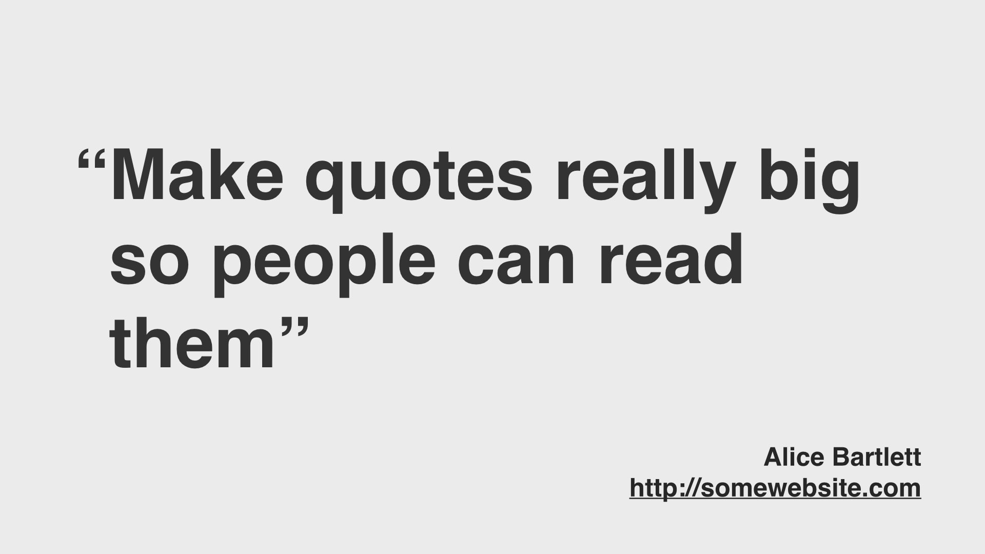
If you can find a good photograph of the person you’re quoting, include that to remind people who this person is.

A slide for showing a picture of a website
YMMV but I show a lot of pictures of websites in my talks. Make sure they’re are as big as possible, nobody needs to see all that browser chrome. Make sure there’s a place for the url of the page (leaving the address bar in will be too small).

If you want to draw attention to a particular part of a website, make sure you have a design for that too. I like to darken the bits of a page or diagram that aren’t important.

I also have a design for showing a page in a mobile browser.

A slide for your “power quotes”
Before I spoke at Nordic.js, they asked me for my talk’s “power quotes” so that as I gave my talk, they could tweet the important bits. This is quite a good idea really, it helps get the thing you want to say in front of more people. To help my points carry further, I put the really important stuff on it’s own slide and make sure it’s big enough to photograph from the audience.

A closing slide
At the end of your talk, there’s a finishing slide. Something to say “thanks for having me, go here for more information”.
